Your cart is currently empty!
How to Improve your Design’s Aesthetics with Graphic Design
The following text may contain affiliate links. Nollie receives a commission from qualifying purchases without any additional cost to you. All products featured are used and recommended by Nollie’s Design Team.
Do you want your design work to look more visually appealing? Do you struggle to lay out your portfolio? Understanding Graphic Design can have a huge impact on the overall Aesthetics of your work.
Welcome to our Aesthetics series, in which we’ll look through how to improve your visual communication and learn the tricks to make your work look beautiful. Each Principle is linked to a design field, with Aesthetics taking many cues from the world of Graphic Design.
At Nollie, we want to show you design’s transferable skills through the 12 Principles of Generalist Design. We want you to know that you don’t need to feel confined by your creative specialty and that your creative process is versatile and allows you to try your hand at different types of projects.
This isn’t something new, this used to be the norm. Creative people would allow their curiosity and skills to guide them into different projects. We write about these versatile designers in our Past Masters series, like Scotland’s Charles Rennie Mackintosh.
After industrialization and the invention of the production line, companies want one person to do one thing very well over and over again. But your creativity doesn’t work for a company, it works for you.
Generalism is returning to other creative industries like Music or the Culinary industry, why are we not following when we face many of the same challenges? You wouldn’t tell a chef they can only cook one type of food, or tell a musician to only play one instrument. We understand how their skills would transfer over, but within design, this way of thinking is pretty uncommon. Why?
Generalism is where the Design industry is going, but we take so much pride in our specialty, that we often overlook the other creative disciplines rather than respecting and learning from them.
By learning from multiple fields of Design, you can build your creative skillset and pick and choose elements you want to use in your practice. This will future-proof your career as you’ll have multiple creative skills to fall back on and will have a bigger picture of Design as a whole.
Why Every Designer Should Learn Graphic Design
Graphic Design is the art of visual communication. Being able to communicate your ideas visually should be a skill possessed by every designer. It will improve your understanding of what makes things look good, and improve your presentations, pitches, and most importantly your portfolio.
Not only will Graphic Design make your work look better. Learning Graphic Design will also provide skills that will transfer into other areas. For example, once you learn how to create Vectors in Illustrator, you can then use them to produce Fashion Design patterns or you can use your knowledge of color theory when creating an Industrial Design project to determine the color of your product.
In this context we want you to learn the fundamentals of Graphic Design so you can learn what makes something pleasing to look at and why. Once you understand these principles, you can apply them to other forms of Design.
Most importantly you can utilize your Graphic Design skills in your portfolio to present your work appealingly. When you are job hunting, directors will spend less than a few minutes looking at your portfolio. Having a compelling visual language that matches you and your work will help keep their attention and get you to the next stage.
Once you start to understand Graphic Design, you will never be able to see the world in the same way again. Every store you pass, every poster you look at, you’ll notice the fonts and graphic layout and color choice, and the list goes on.
Your non-designer friends will think it’s weird that you suddenly become so obsessed with fonts. Trust me, I know from experience. Be prepared for how much you’re going to notice Helvetica in your day-to-day life.
A Brief History of Graphic Design
While humans have been using visual communication since we were living in caves, the recent origins of Graphic Design can be traced through typography and the invention of the printing press.
Books were booming after the invention of the printing press, and book manufacturers made their own fonts to print in the books. Books at the time were written with individual letters set on a block to spell out an entire page. The manufacturers of these letters were known as Type Foundries and many are still in existence today.
After the Industrial Revolution, there became a backlash against soulless mass-produced designs, which led to Willam Morris’ Arts & Crafts movement. The Arts and Crafts movement was to replace these soulless products with something that had artistic value.
This set off a trend, the Arts and Crafts movement led to a boom in “New Art” known as Art Noveau. Which looked back at historical art as inspiration and where we find our old pal, Charles Rennie Mackintosh, who was working on a style within Art Noveau with his friends that became known as “The Glasgow Style.” Art Noveau forced companies to put more effort into designing better-looking products.
War played a huge role in Graphic Design, as WW1 and WW2 forced designers into creating propaganda. Between WW1 and WW2, styles had emerged from contemporary art, however, these were rejected in the 50s looking to create a neutral style, which was found in Europe’s neutral country Switzerland.
The Swiss Style became known as the International Style and follows much of the visual identity we follow within Graphic Design today. Simple easy-to-read logos, grid structures, and simple shapes.
The principles have been enhanced thanks to the development of digital software and technology and have created a new ground for creative work.
How to get started
Graphic Design is the easiest way to start learning design. Graphic Design is the most accessible form of Design and the perfect entryway to becoming a Generalist Designer.
Firstly, a lot of the fundamentals can be learned with just a paper and pen. If you are new to Graphic Design, or design in general I’m going to assume you have some creative flair so this should come naturally.
Another reason Graphic Design is one of the most accessible forms of Design is that there are countless tutorials, resources, and software that make it easy to grasp.
You can begin designing as soon as you learn the fundamentals, which we’ll try to cover as much of in this post.
What equipment do I need to get started with Graphic Design?
A Design Notebook
Keeping a journal alongside your design work is in my opinion one of the best ways to further yourself as a Designer. I believe they are vital to my career’s success and encourage anyone reading to begin writing as a daily task. Here you can write down your to-do lists, write project progress, or even just your favorite swear word in all caps if the mood strikes you, which it will.
I have written before about the importance of keeping a Design Journal. I use a Bullet Journal, as it allows me space to sketch yet still stick to a grid when I’m writing and helps with drawing straight lines for diagrams, orthographic drawings, and measurements. But you can start with any notebook you have lying around!
Sketchbook
A good sketchbook is vital for any Graphic Design project. When you are starting a project, you can use your sketchbook to come up with ideas quickly and messily.
You should always sketch your ideas first. You can be messy and draw whatever comes to mind. Putting pen to paper is great for your brain, and helps set out what you plan to achieve in your final solution.
The Best Software for Graphic Design
Adobe Creative Cloud
If you are serious about becoming a designer, then I would recommend learning within Adobe Creative Cloud, with the holy trinity of Graphic Design software, Adobe Photoshop, Illustrator, and InDesign. These software are considered the industry standard and you will be using them in any design agency.
As the industry standard, many of the tutorials, resources, and learning materials are geared toward learning in Photoshop, Illustrator, and InDesign. These have been at the forefront of Graphic Design for years.
Photoshop is the best software for editing and manipulating images. Images in Photoshop are based on pixels, which can be edited using tools in the software.
Illustrator uses Vectors to create shapes. Vectors mean that the shape is understood through maths so that the object can be scaled larger or smaller with absolutely no loss of quality.
InDesign is used for the creation of Print Media, like Flyers, Pamphlets, and Posters.
Another reason I recommend getting Adobe Creative Cloud is that it doesn’t just provide access to Photoshop, Illustrator, and InDesign, but also a host of other creative software.
It also comes with AfterEffects for Motion Graphics, Animate for Vector based animation, PremierePro for filming and Editing, and Audition for recording audio. There is also new free AI image generation through Adobe’s Firefly.
An Adobe subscription also gets you access to a free portfolio website with Adobe Portfolio, access to Behance, and access to graphic assets with Adobe Stock.
If you are an aspiring Generalist designer, then Adobe will open the possibility to explore different fields much more easily. Adobe is used across Graphic Design, Fashion Design, Industrial Design, and others. Adobe’s software is the dominant creative software and its versatility allows many creatives to create their designs, no matter their background.
Also, as we look into the other design specialties, Adobe will be the common software across many of the principles. Many of the tips and tricks will come from using Adobe software.
Affinity
Affinity is a good alternative for those who can’t afford an Adobe subscription, but there are fewer tutorials and resources to help you learn the software when compared to Adobe.
From my experience with Affinity, their software does much of the same as Adobe, but I struggled to make graphics as quickly as I could in Adobe. I found it pretty frustrating. My workflow took much longer as everything was labeled differently and when I tried to find specific tools, I found out they were unavailable in Affinity.
The interface is different from Adobe, so when you transition into a professional design career you’ll need to relearn everything. This is why I encourage designers to start learning Adobe, if you are a student you can get a hefty 65% discount.
Canva
Ah Canva, the software the professionals love to hate. Don’t get me wrong, I like Canva. I think it is a great way for people to be introduced to Graphic Design. It’s free, you can use it from your internet browser, and it’s very accessible to those who want to dabble with Graphic Design.
But it does not do the same job as professional design software. For starters, it isn’t designed for professional designers, but rather small businesses and content creators who need quick template style graphics.
Adobe now has Adobe Express as a direct competitor to Canva. So if you have an Adobe subscription you’ll also get Adobe Express, allowing you to make the same template-based content.
Inkscape
Inkscape is an open-source alternative to Adobe Illustrator. Open-source software is designed by a community of developers to create free or cheaper software. The issue with Inkscape is the same as Affinity, in that there are fewer resources to learn the software and you will need to relearn them if you get a professional design job.
Gimp
Gimp is another open-source alternative, this time to Adobe’s Photoshop. Personally, I find Gimp very clunky in comparison with Photoshop. The thing with open-source software is that it is free for a reason. Sometimes it’s clunky and any issues you have will be harder to resolve.
What do I need to know?
Typography
Typography is the art of words. As Graphic Design is about visuals, you will need to convey information through text. Selecting the right type of font is essential to help convey the message you are trying to deliver in your work. Each font (or typeface) has different visual elements that make it suited for different uses.
If you are a beginner, I’ll outline some simple rules of thumb that will help get you started with understanding the basics of typography.
You should never use more than three fonts in a single design, two is probably enough. There are exceptions to the rule, but you need to know the rules before you can creatively break them.
Overloading your work with fonts is a common mistake made by beginners. Massimo Vignelli, famously only used five fonts throughout his career, Helvetica, Futura, Times New Roman, Bodoni, and Century.
Pair your fonts between Display Fonts and Body Text Fonts. Display Fonts are big bold and full of character. Think of a movie poster, a display font would be the font they are using for the movie title. A body text font would be the less artistic style font used to explain the date of release, the cast and director, and the production.
A serif font has little tips (called serifs) at the end of the letters, you’ll recognize it in more traditional-looking fonts like Times New Roman. A sans-serif font (meaning no-serifs) is more modern looking. The font you are reading right now, Gill Sans, is a Sans-Serif font. These two different types of font have different anatomy. A common practice is to pair these two different styles together.
Helvetica. Designers love Helvetica. So much so there’s even a movie about this font! Its impact can be seen everywhere. It’s become the default font for many practical designs like in airport terminals or motorway signage. If you want to go and find fonts in the wild, it won’t take you long until you spot something made with Helvetica.
Pixels
Pixels are the small dots on your screen that make up an image. Each dot on your screen can output different colors. The colors are made up of a mix of Red, Green, and Blue light known in Graphic Design as RGB. When you mix all of the colors with light you get white. These dots make up the resolution of your screen.
When you set up a new file in Adobe Photoshop or Illustrator, it will ask you for the document’s DPI, referring to dots per inch. When designing for web media, you’ll be designing at around 72 dots per inch. This is the resolution of your design.
Pixel-based artwork refers to artwork that is made by manipulating the color of pixels. Think of a photograph you see online, there are different shades and colors in every pixel.
Pixel-based artwork requires you to know the output resolution when creating your designs, as they can’t be scaled. For example, if you take an image with a low resolution and scale it up you’ll see the original pixels become too large and you end up with a negative effect known as “pixelation.”
If you are designing something to be printed, the resolution will be different, as printers have a much higher resolution than computer screens. You would need to set your document to 300 dpi. This means that when you print you won’t have any pixelation and your work won’t look like a retro video game.
You would use a pixel-based design if you were doing photo manipulation and picture-based content.
Vectors
Vector-based artwork uses complex maths to understand shapes. Don’t worry you don’t need to factor in the maths, the software does that for you.
Being around new designers, there can be a lot of intimidation when it comes to designing vectors. It’s a very different process from creating pixel-based artwork.
For starters, you manipulate shapes using anchor points. The line between two anchor points becomes a path, and you manipulate that path using Curves. The software understands the maths between all these points and maintains them as you make the design larger and smaller, meaning you never experience pixelation.
Vectors are made in Illustrator using the Pen Tool. The most important tool for Graphic Designers in my opinion. Once you understand this tool, it will come in handy for other fields of design like Fashion and Industrial Design.
Thankfully there’s an amazing game, The Bezier Game, which allows you to learn the art of designing Vectors with ease. I highly recommend this game to people starting with Vectors for the first time as it quickly lets you understand how this type of Graphic Design works. I remember a few years ago, to train a work experience employee, we raced each other through the levels.
Color
Color plays a big part in Graphic Design and will play a big part in understanding Aesthetics. As we previously mentioned, screens use red green, and blue (RGB) lights to make up the colors of an image on screen. For printed materials there is no light source, so the colors are made up differently.
For printed work, the color scheme used in printers is Cyan (a light blue), Magenta (a vibrant pink), Yellow (yellow), and Black (Called K). This is known as CMYK colors. With RGB, white is the color that appears when you put all the colors together through a light source. With CMYK, if you mix Cyan, Magenta, and Yellow you get Black. The black in CMYK is an extra black that’s added using black ink rather than mixing all 3 colors to make it. This helps reduce the cost of ink, which is expensive.
Similar to typography, the color you select can play a big part in delivering the message you want to portray, this is known as Colour Theory. Color Theory refers to how humans react to different colors and once you know it, it’s another thing you can’t unsee.
Blue is associated with calmness and health, Purple is associated with luxury, Red is linked to passion, Green is associated with food and health, Yellow is connected with Comfort and Convenience, Orange is linked
Color theory also refers to knowing the hue, saturation, contrasting colors, and complimentary colors. Thankfully there’s another game, by the same, maker which helps you understand these principles better. https://color.method.ac/
Branding
Branding in Graphic Design refers to the consistent visual elements that a company uses. This is known as a Brand’s visual identity and it is the aesthetics element of a larger brand strategy that would cover the company’s name, communication style, and the products that they sell.
A company uses a brand to be recognized. Take Apple for example, you can see their consistency across their marketing material, their stores, their computers, and their phones. Apple has a visual identity that stretches across everything. You can instantly recognize it.
Branding plays a big part in how people perceive a company, it’s why you decide to drink at one coffee shop vs another.
Designing a brand can cover different elements like logos, icons, color, and typography. These need to align with the company’s larger brand goals.
If you want to know more about Logo design, we break down what makes a good logo and give a case study into creating the Nollie logo.
Design Specification
A Design specification is an evolving document that you use throughout the design process to ensure your design functions as you want and that many of the factors for the design have been considered. You begin using a Design Spec at the start of a project and use it as a checklist to ensure your final design fulfills its requirements.
A Design Specification contains hard data about what your design does and should be expected to do. It is split into different categories and allows you to look at your design from different perspectives, like performance, aesthetics, and disposal. Data should be as close to the real world as possible and listed with key data, for example, “The color must be light blue.”
Let’s pretend you’re designing a poster for an event celebrating a product launch. In your Design Specification under the performance category, your poster must promote the event. You would list the date, venue, and all other relevant information that needs to be on your poster. It would include the product that is being launched.
In aesthetics, you would look at the other elements of the company’s brand, and put them in your aesthetics category, like colors being used or typographical elements, like what font you should use. Under Manufacturing, you would factor in the printing of the poster and include the printer’s lead times to ensure everything is delivered on time.
If you want to develop a multitude of creative skills, a Design Specification can be used across multiple design projects and is one of the secrets to building an adaptable design process.
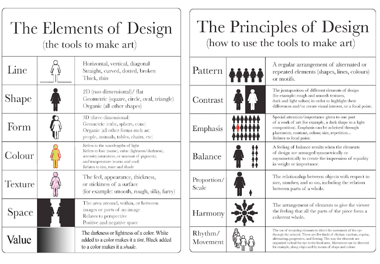
Visual Elements
Tools to make art
- Line
- Shape
- Form
- Color
- Texture
- Space
- Value
Visual Principles
How to use the tools
- Composition
- Pattern
- Contrast
- Emphasis
- Balance
- Proportion / Scale
- Harmony
- Rhythm / Movement
Visual Harmony
Accessibility
Innovation
Innovation in Graphic Design comes from people pushing the limits of their creative practice with practical tools or with software.
Once you have an understanding of the fundamentals of Graphic Design and know the rules, you can break them. Many of the most innovative Graphic Designers are practicing creating new work with a mix of analog and digital tools.
As you learn different forms of Design, you will develop a new ability to spot opportunities to push the envelope.
Trendy vs Timeless Design
Within Graphic Design you will need to find a balance between trends and timeless design. A design trend will come and go, reflecting the current culture and what’s popular in Design. Timeless design is a strong design that can stand the test of time and stay relevant over a long time.
Trends make your work look modern and current, but will eventually fall out of favor and look dated after a while. Trends are best used in Designs that have a short Design Lifecycle, this could be printed flyers, brochures, or posters.
If your work is going to be used for years, you want to try and future-proof your work. For example, a logo will be used by a company for years. Timeless is best explained in the phrase, “less is more.” keeping things simple and just having a strong but functional design will work for years.
Take the example of Coca-Cola vs Pepsi. For decades, Coca-Cola’s logo has remained almost unchanged, with small teaks being done over the years. Their design is timeless. Pepsi on the other hand follows trends more in their logo design, meaning they update their logo more often.
Sustainability in Graphic Design
Sustainability is a factor that we need to address in design now more than ever. As designers, we are almost the gatekeepers of the new products and materials that go out into the world. It is up to us to have a responsibility to change the tides on the crap that ends up getting put out into the world. Traces of microplastic can be found in the human body thanks to the food we eat, our rivers are filled with shite, and packaging is just thrown out with no second thought.
The problem is that as designers we are partly responsible for getting us into this mess. We didn’t fully know the impact at the time. Luckily we as designers are helping contribute to the innovative materials and techniques that can contribute towards us finding a solution.
Whether you’re a progressive environmentalist or a conservative who wants to protect and conserve the natural beauty of your country. It’s a fact, that we need to do something different to help reduce the negative environmental impact of our designs.
Luckily sustainability offers a new opportunity for this generation of designers. As we innovate and find new ways of commercializing those innovations, we are sitting within a new gold mine for design and creative work!
Many elements of Graphic Design can be used to be more sustainable.
One of the most beneficial ways to be sustainable is to watch how you use paper when you are designing. Use all of the paper, don’t erase your mistakes, and use both sides of the page. I think a lot of us imagine throwing paper into a paper basket after every bad idea but that’s so wasteful and best saved for montages in movies.
You know what that’s called if you kept all of your ideas on the same page? Ideation. Keeping your mistakes, allows you to use them to improve your next idea.
This is more of a pet peeve, but if you are cutting a shape out, cut near to the edge rather than cutting in the center of the paper. The number of people I see cut right into the middle of the page, when they cut have cut the same shape nearer the corner of the edge and it would have saved time and paper.
You can be more decisive with your material choices. You can design for paper products with eco-friendly inks, or print on recycled materials.
Design for the disposal of your work. This is known as the Design’s Lifecycle, once your design is out there in the world, what happens to it once it’s finished with? Where does it end up? By factoring the lifecycle in the early stages you can create something that isn’t as damaging in its final form.
Conclusion
Understanding how to visually improve your work will be highly beneficial to your design practice. Even for specialists, implementing Graphic Design could be highly beneficial to your portfolio.
Design has many areas of overlap, and understanding the basics of Aesthetics can be applied in other other types of design projects. It is easily accessible and can be the perfect way to begin diversifying your creative skills.
Having a basic understanding of implementing Aesthetics can allow you
Leave a Reply